Discarded Mockups
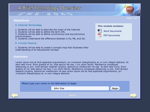
This design provides very basic color coding for usability. The banner and the navigation will remain consistent throughout, the light blue resource boxes will always contain links, the dark blue input boxes will always contain form elements such as input fields, checklists, questionnaires, etc. Institutional items, such as the UF logo can be included in the bottom left of the page.
The image below exemplifies a standard introduction page with an input field and a resource box. If we are going to require students to have certain software/plug-ins, we want to provide them with links to the necessary websites in each module.
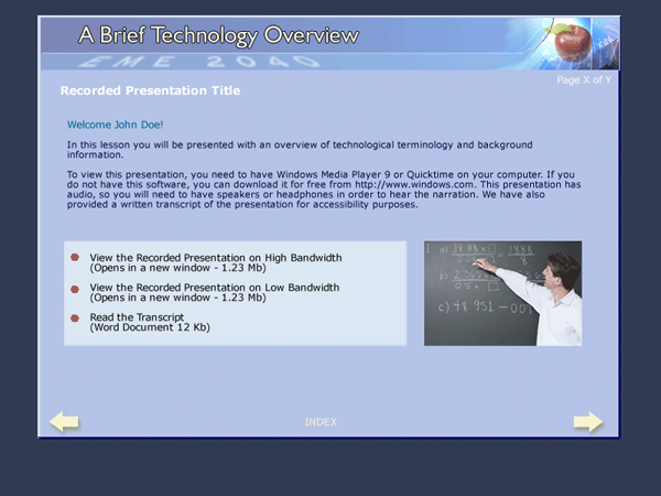
The second image shows a sample recorded presentation page. Since each presentation will likely open up in a new window, I feel that it would be good to have a thumbnail of the image and provide users with multiple versions for download, depending on their connection. This only applies to sections where the client would like video.
If the presentation is going to be done in impatica, we should make sure that the software is accessible, and/or provide a transcript of the audio.
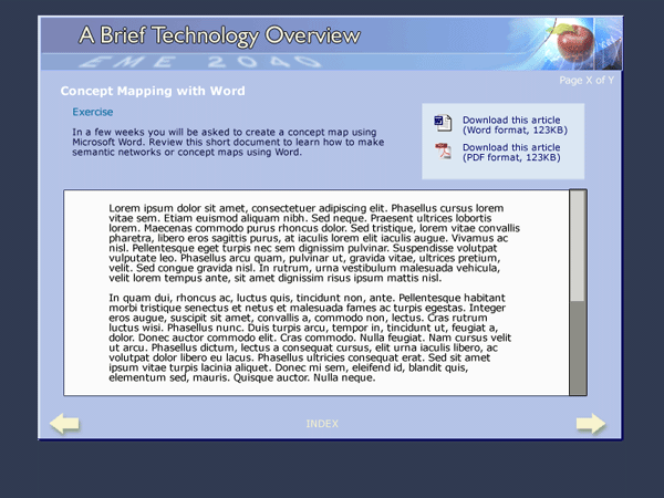
This final image demonstrates a sample Article Page. If the authors would like to incorporate multiple versions of the article for download, we can link to them from the resource box in the top right hand corner.